Overhauling the fares section for the MTA site
One of the most highly trafficked parts of the MTA website is the fares and tolls section. In order to make the pages easier for riders to find and use, I developed a phased reorganization to address these problems:
- There were 31 pages devoted to fares and 11 for tolls. I was skeptical that we needed 42 pages to explain our policies.
- Riders had to click through many pages to find basic information. The relationship between pages was very unclear.
- There was a lot of duplicate information across pages. Not only was this confusing for riders, it was very difficult for us to keep updated. If our fares changed, for example, we’d have to track down every instance where we referenced the specific fare. I wanted this information to live in one canonical place.
- A lot of the content came from print contexts first. It was technically correct and written at a good grade level, but it felt awkward on the site.
- Some content was missing entirely.
Phase one of the reorg
I started with a structural audit of all of the content in the section. There were also pages on the old MTA site that had never been migrated over. Most of those were out of date, but some needed to be reflected on the new site in some way.
Huge hat-tip to Lisa Maria Martin for her structural audit spreadsheet template. I used this to document every page I found and its hierarchy in the section.
That looked like this:
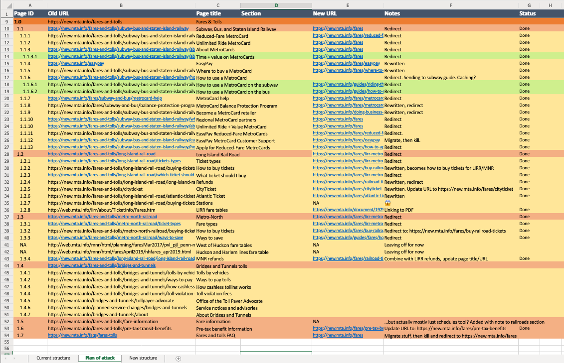
Things I noticed:
- The overall structure of subway/bus fares, railroad fares, and tolls made sense. Beyond those landing pages, the subpages were unorganized and duplicative. Additionally, Long Island Rail Road and Metro-North Railroad information was separate, despite being functionally very similar for riders.
- There were several important pages that were only accessible via inline links on other pages.
- A few pages were mislabelled.
- A few pages were missing entirely.
What I did:
- I decided right away to separate fares and tolls and to tackle fares first. (Most of our readers are looking for fare details, and I have a separate overhaul of the tolls section happening with a different team.)
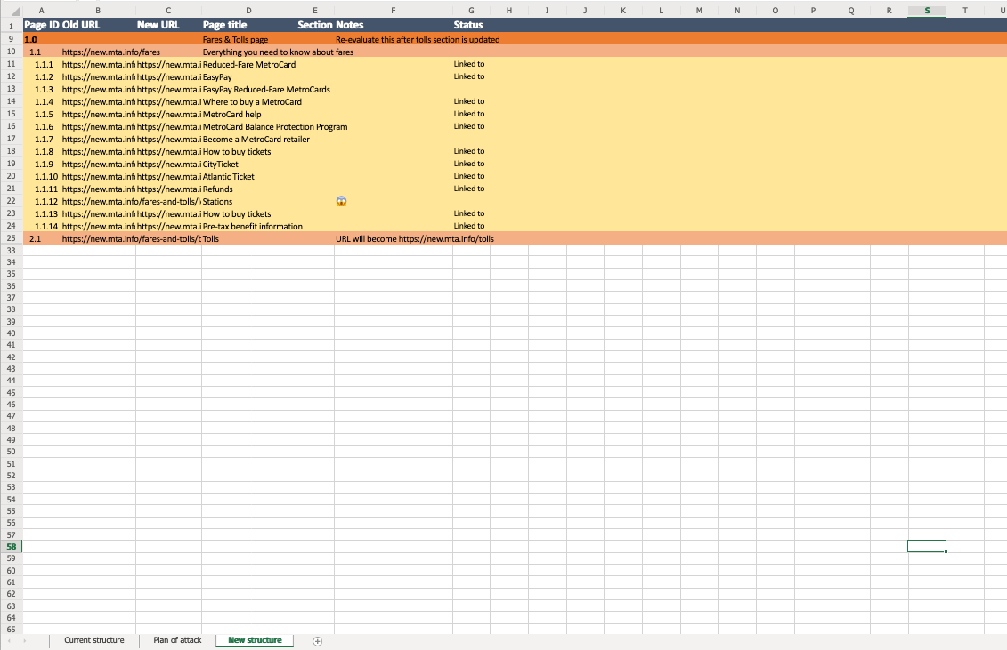
- I knew restructuring the section would require changes to many URLs, so I set up a column to track what the old and new ones were/would be. As I did this, I laid out the new hierarchy in my spreadsheet.
- I worked through the spreadsheet to write, rewrite, and migrate content as needed.
- When I was satisfied with the content and knew which pages I was going to keep, I deleted what we didn’t need. I updated URLs starting with the most distal subpages.
- I wrote and art-directed a new guide to MTA fares. Just before that published, I updated the remaining subpage URLs to reflect the new section structure.
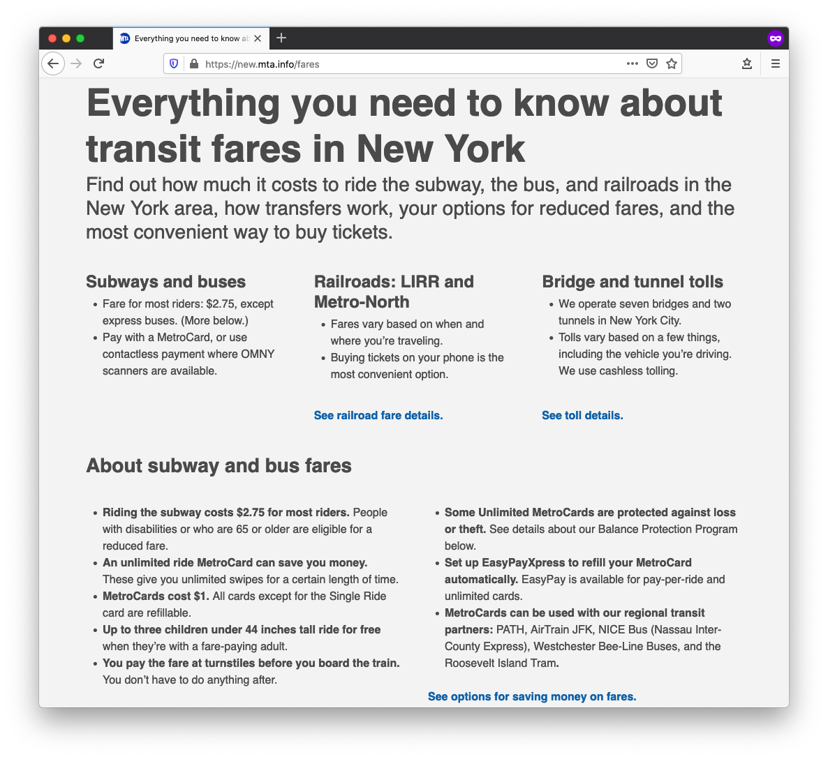
The new structure
Here’s where we landed.
Key changes:
- Categories within the section match what riders expect: subway and bus fares, railroad fares, and bridge and tunnel tolls. The main landing pages contain the bulk of the information, only linking out to topic- or product-specific subpages when necessary. There are now only 15 subpages in our fares section.
- The new landing page emphasizes MetroCards and OMNY, since most site visitors are looking for subway and bus information. We link to pages for railroad fares and toll information prominently, so that’s also easy to find.
- I also wrote a page specifically about saving money on fares. This includes details about city and employer programs, as well as MTA programs.
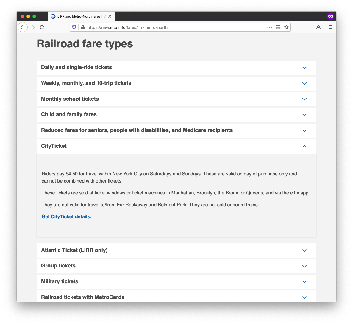
A content component we call an accordion was key to centralizing information about different kinds of fares. Most of these ticket types were on separate subpages before. Now, riders can see all of their options at once.
What’s next
You guessed it: Tolls! A lot of this is underway already as part of a different project. When that content is ready, I’ll re-evaluate where all of this lives on the site.